The Bantam Cover Story
 (Editor’s note: In 1997, Ron Hill wrote the following article for the Hidalgo Trading Company. We’re reprinting it with no editorial changes. We’ve just updated the links.)
As a cartoonist, illustrator and advertising art director, the Doc Savage book covers have always had a special meaning to me. I practically learned to draw the human figure at thirteen by copying Doc in all those fantastic, dynamic poses. Later, as a professional graphic designer, I came to realize the Bantam cover designs of the Doc Savage reprints go beyond the excellent choice of James Bama as the first cover artist. The entire design concept surpasses good illustration: it is design that was ahead of its time.
Just look at any other paperback that came out in 1964, such as the Ballantine Tarzans (#23, #24). The illustration is mired in the stylized magazine look of the Sunday supplements. There is type all over the place: the cover is divided into sections, or boxes, which slows down the shopper’s eye. One box for title, one for NEW (tilting crazily like a newspaper advertisement), overprint for Authorized edition info, and they have to tell us twice (once in numeric form in the top right and again in text along the author’s name) what number the volume is.
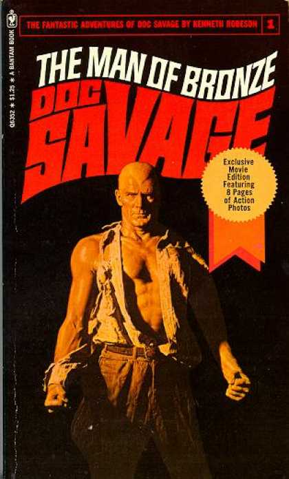
 Now look at The Man of Bronze cover. Clean, full bleed, no boxes — it screams for attention in its simplicity. The delta-sweep-stylized logo perfectly captures the imagination, while remaining legible and almost visceral in its strength and visual appeal. Of course the work of James Bama was the perfect way to go with presenting Doc to a new generation of fans…realistic enough to shore up against the camp of the novels, but striking and exotic (and instantly as recognizable as Superman’s costume) with the dual element of the torn shirt and the severe widow’s peak. Capturing Doc in a variety of tense, action-frozen poses is also a delightful nod to the pulp covers that I have been able to see.
The designers at Bantam do seem to take a few covers to get the look right. The Thousand-Headed Man appears to have Bama backing off of the sharp, skull-cap-look by trying to make the widow’s peak more plausible. The Meteor Menace and Polar Treasure have Doc much too small to be a striking, news-stand presence.
Brand of the Werewolf is too cartoon like. It seems that there are suddenly two ways to present a Doc cover: either literal The Motion Menace where Doc is in an actual setting, or symbolic, The Devil on the Moon, where Doc is juxtaposed against a figurative background image that represents the “menace” of the story.
It is also evident that the publishers feel guns sell, because Doc wields a firearm on five of the first 67 covers (three times in the first 15). The Lost Oasis has a weird color scheme, with Doc looking like a romantic lead from the 1930s cinema. The Monsters treats us once-again to the delineated realism of that gloriously wrinkled and torn shirt.
Then there is my vote for the worst cover, The Land of Terror (although at 13 I was a sucker for dinosaur-lost-world stories back to Burroughs and Doyle). This cover was the one that always had me suspect a ‘ghost-painter’ in the woodshed. Not until years later (today, in fact) Dale Dodson, a fellow artist, brings an article to my attention a Starlog article about James Bama by Will Murray. My suspicions are correct; according to the story, Bama had to wrap up some “artistic commitments” and evidently couldn’t paint all of the above; Dale is virtually certain (and I would agree) that he didn’t paint Meteor, Polar, Werewolf (Dale has a copy of Werewolf that is cropped high enough to show another signature), Oasis and — thankfully –Land of Terror.
Dale thinks the signature on Werewolf reads MKunstler, for Mort Kunstler. I don’t know if this cover painting seems consistent enough with the others to say Kunstler painted the other four, but Land of Terror and Lost Oasis seem like the same artist — look at the brush strokes on the volcanic steam and the machine gun flame.
(Editor’s note: According to Vincent diFate the artist for those two novels was Doug Rosa. DiFate could find very little about Rosa. We found out a bit more. He also thought that Bama wasn’t available as he was on his honeymoon.)
At any rate, Bama is back on the ninth cover with The Mystic Mullah and, of course, The Phantom City (an obvious favorite with the collectors), the covers reached an excellence that has to stand as a high-water mark in series publishing. Some of the highlights have to be: The Dust of Death, The Squeaking Goblin, The Giggling Ghosts and The Men Who Smiled No More (that has got to be Monk to the left, with I would guess Ham and Long Tom in the back to the right).
After Bama’s artwork disappeared from the covers, Bantam did the smart thing and didn’t tinker with the design. The covers slipped a little in illustration quality; the rendering seems fine, and the shiny-metallic look works (he is the Man of Bronze, right?), but why does it seem like Doc is turning away or hiding from each menace (literal or symbolic) and on many of the covers he is actually running away? See Quest of the Spider, The South Pole Terror and Murder Mirage and you’ll know what I mean.
After these covers (and a couple years off publishing, if memory serves me right) they actually contracted Boris Vallejo to turn out half a dozen; I don’t feel they got their money’s worth. Boris is too brightly pastel on the The Roar Devil, and better with big-busted babes.
Bob Larkin did fine for most of the rest of the run, but with a shaky consistency. Look at The Time Terror, aren’t Doc’s shoes way too big? And yet The Black, Black Witch has a nice action flow. Omnibus #5 stands up in detail and tension to most of what Bama produced.
One has to remember the purpose of the cover has always been the same: to make the shopper plunk down 45 cents (or 95 cents, or seven bucks). True, the book has to stand up to this test, but it is still the cover that will first be judged.
Bantam’s Doc Savage series is reportedly the first numbered line of action-hero books. This artist and designer maintains that it is also, after 30 years, the best-looking series ever published.


Regarding your description of the cover of ‘The Men Who Smiled No More’……..the fellows on the right side of the cover, the one directly on Doc’s left is James Bama himself. Bantam tried to get Bama to return to painting the Doc covers but by that time Bama was making 4-5 times more painting western covers and that out priced him for Doc Savage. This info came from Bama himself.
Thank you for your research and a fascinating read! I”m in Scotland; I’ve become acquainted with these covers only since COVID lockdowns and reading Doc’s adventures through online Fantom and sources.
Of the artists mentioned here, I’d only previously known of Vallejo.
The action poses and ‘mood’ with other cover elements are indeed eye-catching and evocative; a potent draw to read what follows!
Not a comment but a question. So James Bama did 67 Doc Savage covers? Save Land of Terror without a doubt. Thanks.